Overview
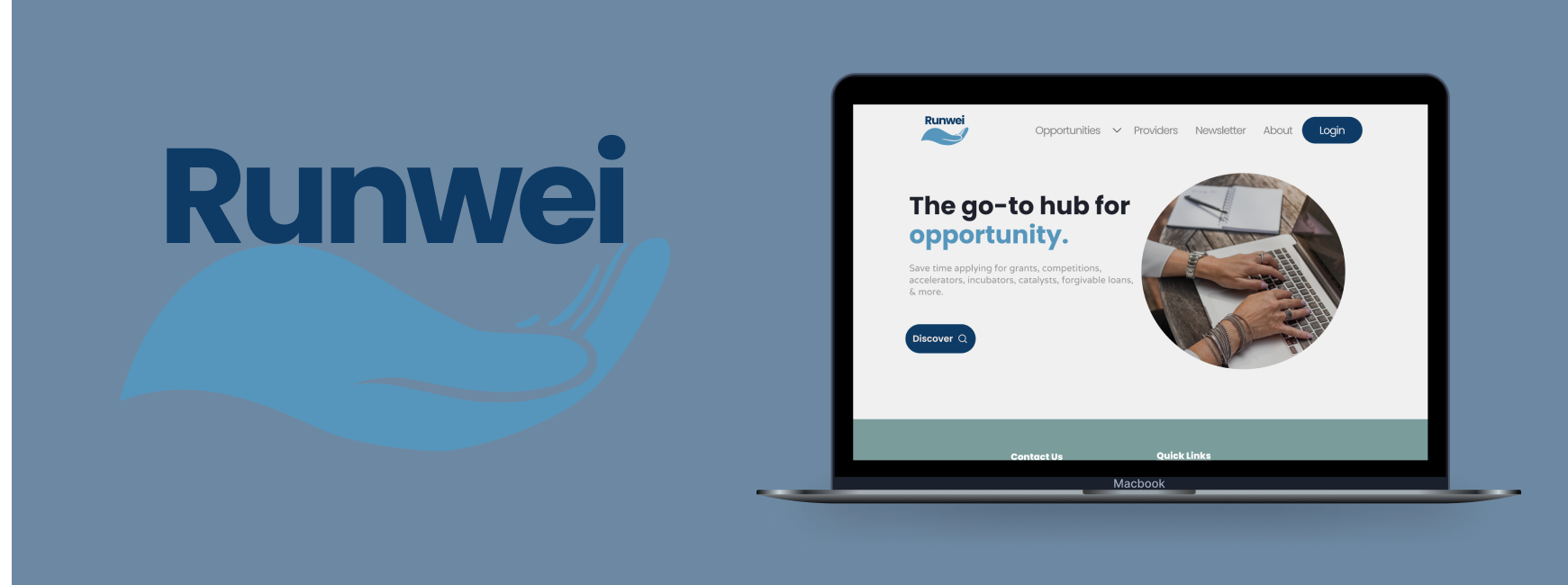
Runwei™ is a web application that utilizes AI technologies to redistribute opportunity access to socially and economically disadvantaged individuals (SEDI) entrepreneurs and small business owners.
My Role
User Research, UX Design, UI Design, Usability Tester
Timeline
October - December 2023
The Problem
Runwei™ is a web platform that utilizes AI to redistribute opportunity access to socially and economically disadvantaged individuals. Runwei™ is engineered to pinpoint and tackle the distinct challenges encountered.
Runwei™ is looking to enhance the user experience and streamline the application process in order to increase user engagement and satisfaction.
Competitive Analysis
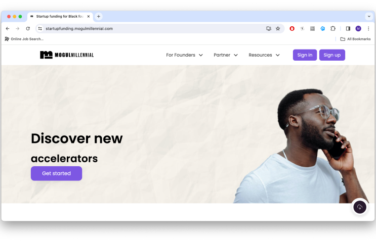
Mogul Millennial:
easy to navigate
values member feedback
offers reasonable pricing tiers
every link opens in new tab
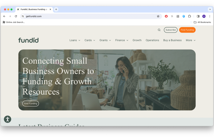
Fundid:
available opportunities visible on the homepage
good visual hierarchy
friendly and approachable website
Gust:
easy, clear and scannable browsing
chatbot available
informative blogs available
startup support system available
Runwei™ SWOT Analysis
User Persona
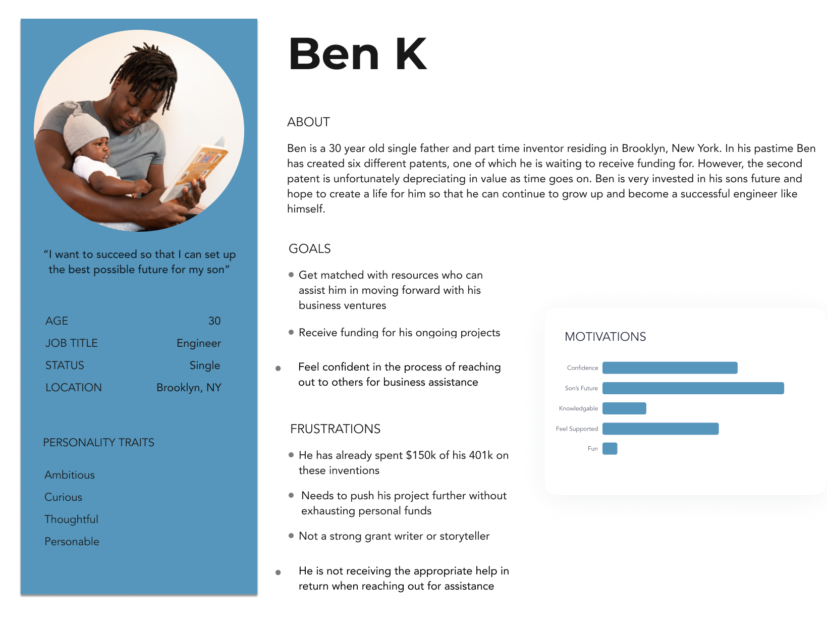
After analyzing competitors and doingn a SWOT analysis of Runwei, we wanted to get a better understanding of the target users. We conducted interviews and created user personas based on the information we discovered
Sitemap
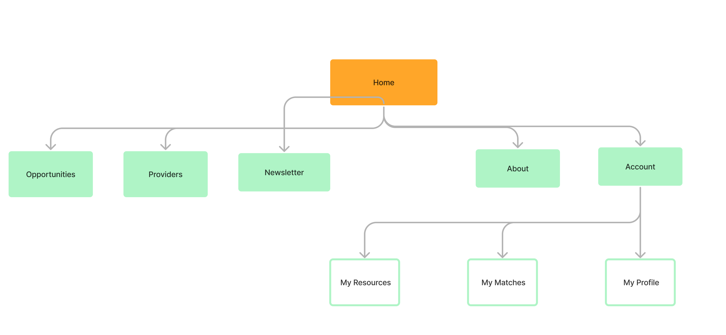
From our findings, we wanted to make Runwei™ easy as well as simple to use. The idea behind the sitemap is that it shouldn’t take more than 3 clicks to get to the screen you need
User Flow
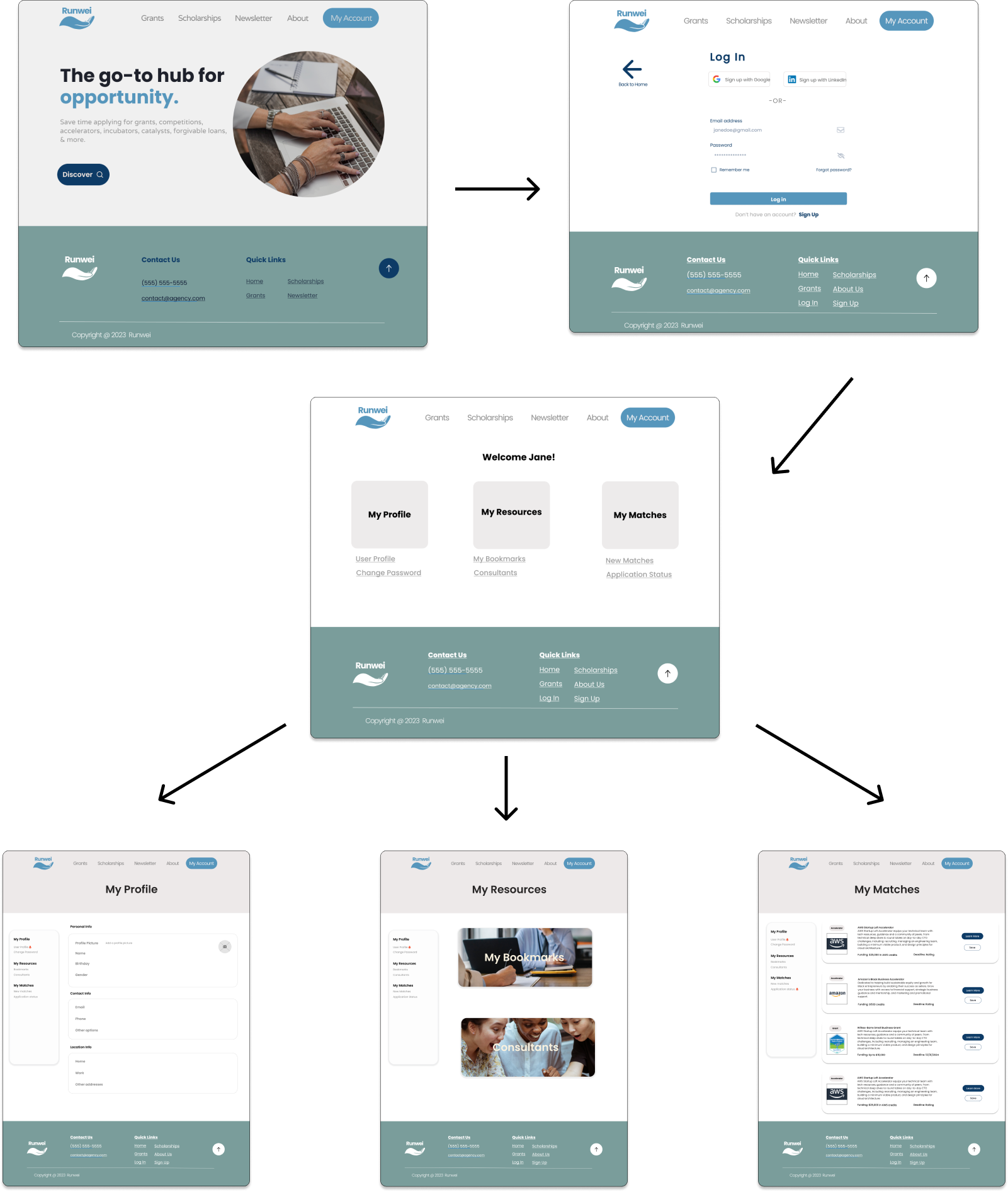
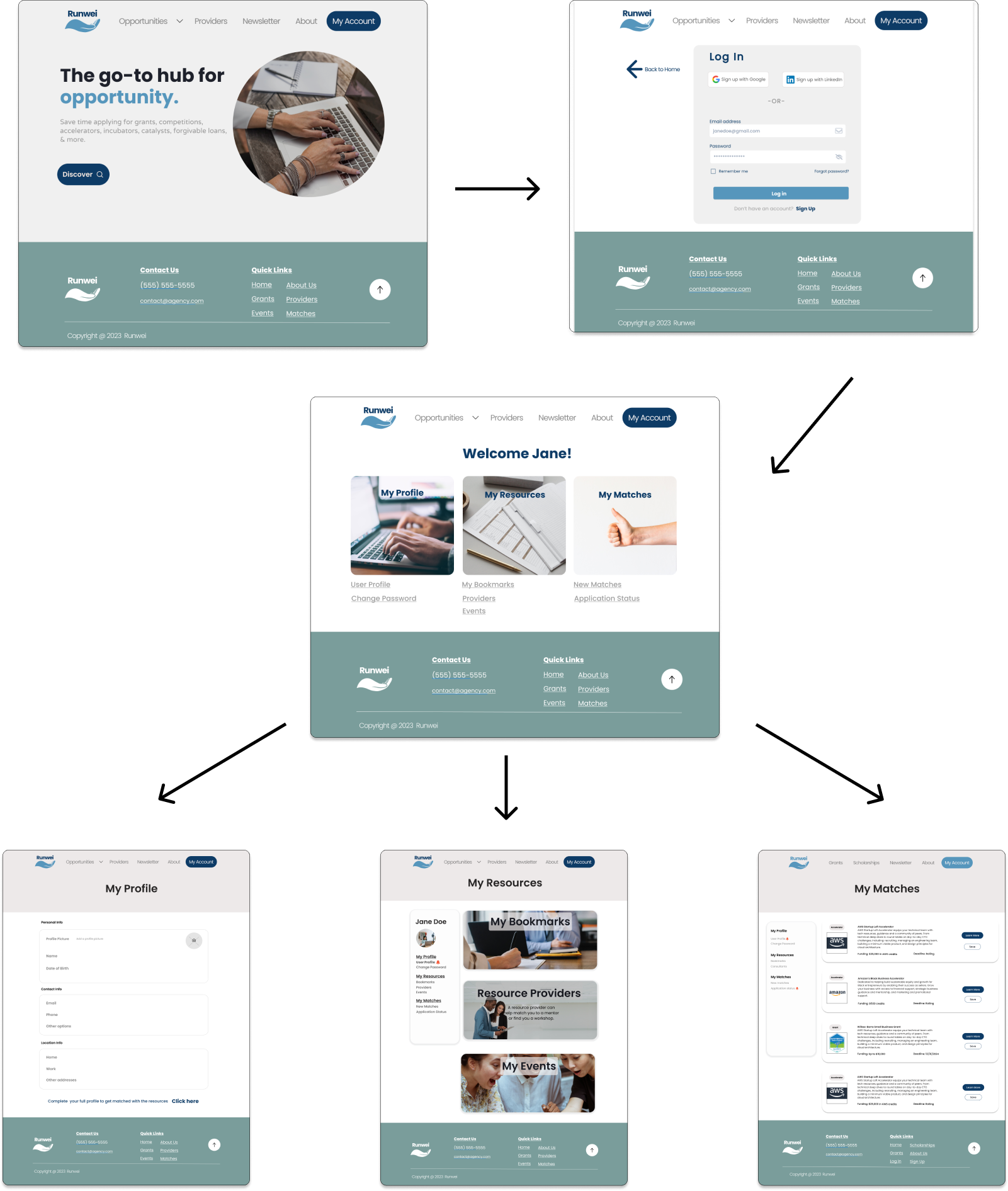
This user flow shows how a Runwei™ user would navigate the site. It’s very simple and accomplishes the goal of the user.
Color Palette & Font
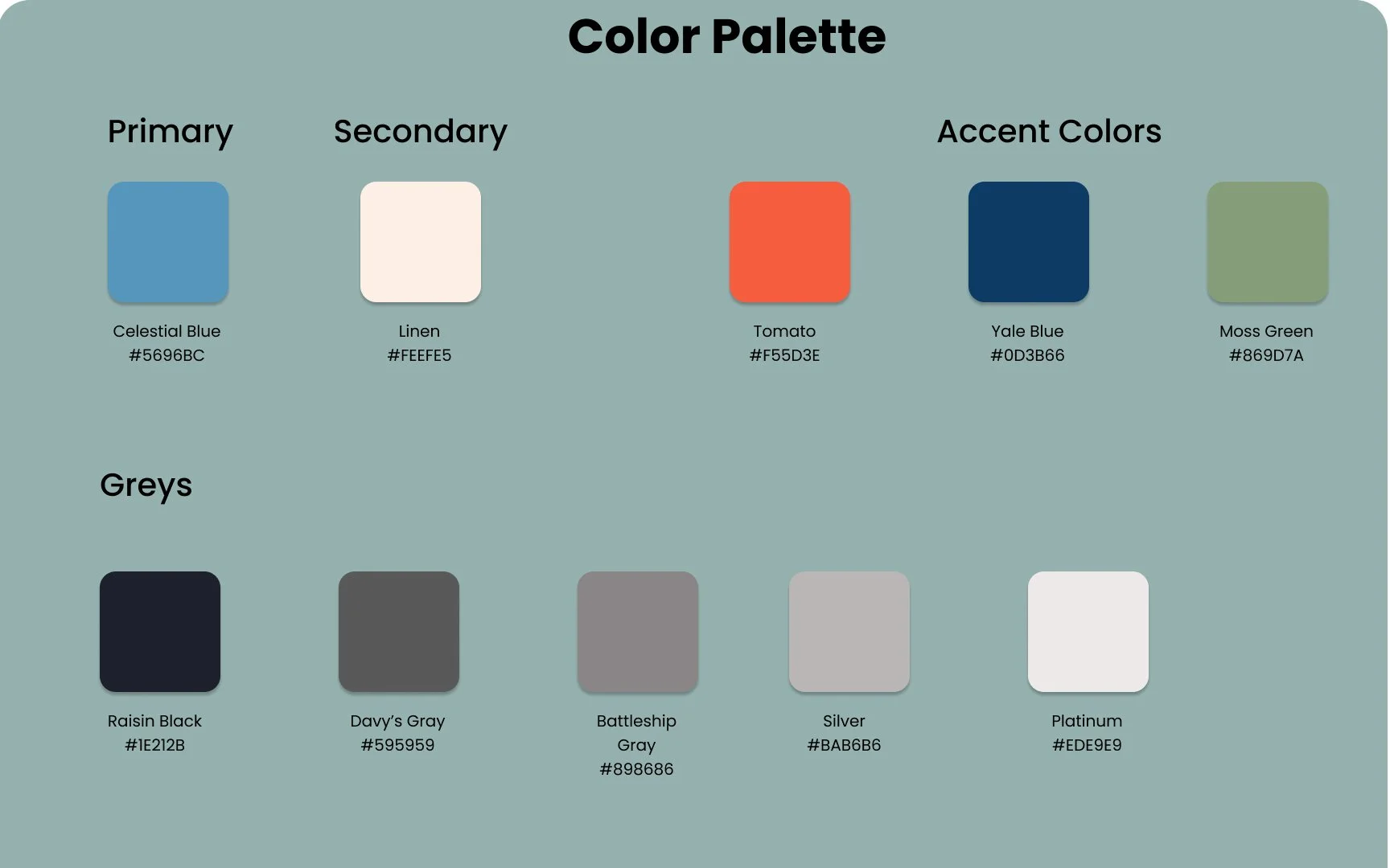
For Runwei™, we wanted to show a consistent brand identity that could have a positive effect on users as well as those curious about Runwei™. Consistency can build trust, and by having consistent branding - users will feel reassured and more likely to trust Runwei™.
For Colors, we looked into the psychology of color and branding and discovered that blue evokes feelings of “competence, trust, dependability, and security.”We chose the color Celestial Blue as a comforting, welcoming color for users to align with the brand.
For typography, we really like the font, Poppins so we chose a complimentary font for other usage throughout the site. Poppins is a clean sans serif font that can work well on big screens and even on smaller devices. Its readability and versatility make it suitable for various purposes from the big headings to a smaller body text.
Low Fidelity Wireframes
Usability Testing
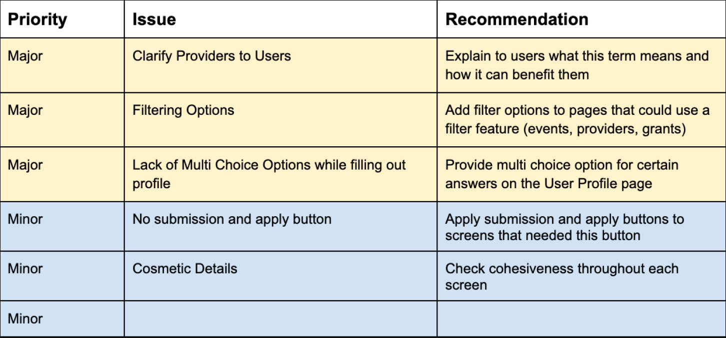
For Usability Testing, we were able to test with entrepreneurs which gave us insight to what they look for when navigating websites similar to Runwei™ the main concerns for testers were clarification as well as filtering options. Most entrepreneurs do not have time to search through things so having a filter was really important to all of them. Besides that, the other issues were more cosmetic details.
High Fidelity Wireframes
Reflections
