Overview
GalleryPal is a mobile app
My Role
User Research, UX Design, UI Design, Usability Tester
Timeline
Design Spring (1 Week)
DAY 1: Understand + Map
The Problem
GalleryPal wants to design a way to improve the experience of viewing art in a museum or gallery.
The want to focus on improving the in-person viewing experience by having a mobile focused application. This led me to think a lot about how a user goes about experiencing a museum or gallery. What is the best way to get information about a piece of art or an exhibition that gives information like a tour but is focused on solo enjoyment?
The Solution
I wanted to make it easy for users to learn more about art at their own discretion.
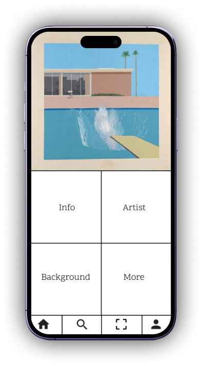
There are options for users to choose what they want to learn about the piece
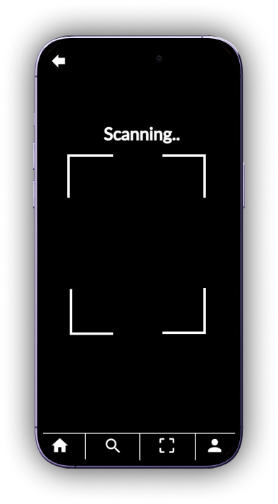
Scanning art makes it an interactive experience
Persona
“I enjoy going to the museum, but I often leave feeling like I didn’t appreciate the art to it’s full potential".”
Insight
Identifying the How Might We’s:
How might we experience a gallery or museum better?
How might we give information and an experience together?
How might we provide users with their choice of information?
How might we make users more educated?
How might we support users wanting to learn more?
Map
DAY 2: Sketch
Lighting Demos: Competitor Apps
Crazy 8’s
Solution Sketch
DAY 5: Test
Findings:
DAY 3: Decide
Storyboard
DAY 4: Prototype
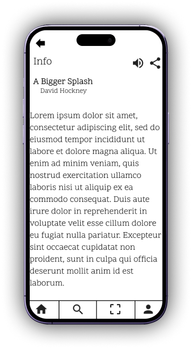
For prototyping, I decided to use Figma. It’s a very simple design but it gets the goal of the app done successfully.
Research Insight
“Sometimes I’ll do a quick Google search for a painting while on my phone while at the museum..but I usually find long articles that are super overwhelming.” - Nick
“I enjoy looking at art, but sometimes I feel like I’m missing out on the full experience by not knowing any background information or context.” - Anna
“I may do a little research before my visit, but I always find a work of art that catches my eye that I didn’t read about beforehand.” - Claire
“I don’t really enjoy group tours because I liked to do my own thing..but sometimes I listen in to learn a few facts about the artist, or the piece itself.” - Ryan
Usability Testing
Users Interviewed:
Late 20s - Early 30s
All working professionals
3 Women and 2 Men
Angela, 23
Junior Art Director
New York, NY
Daily Art is an app designed to learn about Art History. The app usually provides one art and one story to accompany the piece. There is also an option to search for certain art/museums/artists as well. No signup is required but they do allow the option to do so.
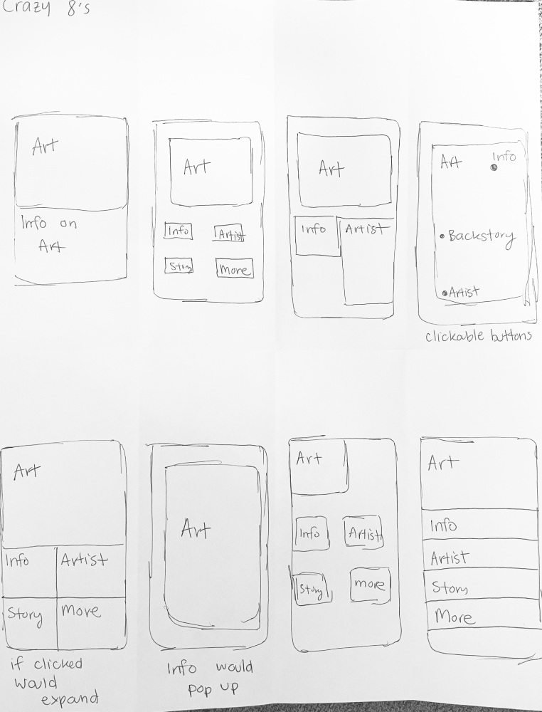
For my Crazy 8’s Sketch - I found the most important screen to be the screen where the user will select what they are interested in learning about. This gives users the freedom to learn what they want.
The Storyboard Sketch fleshes out the path the user would go to most frequently. In this storyboard you can see the user go from the homepage to the information on the art they are looking for
The most important part to me was to show the menu on the bottom to make it easier for users to go back to whichever page they’re looking for.
Interview Experience:
”This app is pretty simple. It could be more visually appealing.”
Once selected, information is given to users to gain more knowledge.
Behavior:
takes advantage of all the world class art in New York
visits every couple of months
isn’t specifically looking for anything
Goals:
wants quick information while looking at art
wants to have a better experience
Frustrations:
enjoys going to see art but knows she could enjoy it more
has tried self educating but finds it overwhelming
“I don’t need to know everything, I just don’t want to feel like I was missing out on something.”
From these interviews, the takeaway was that most users want to be informed and educated about the art they’re viewing but find doing their own research or joining a tour too much too handle. It’s good that they want to learn more but they want to learn on their own terms
”The order of operations on the app is quite easy to follow.”
Smartify’s mission is to connect users with art collections through technology and storytelling. They want to make it easier to discover, remember and share art. They will show nearby exhibitions.
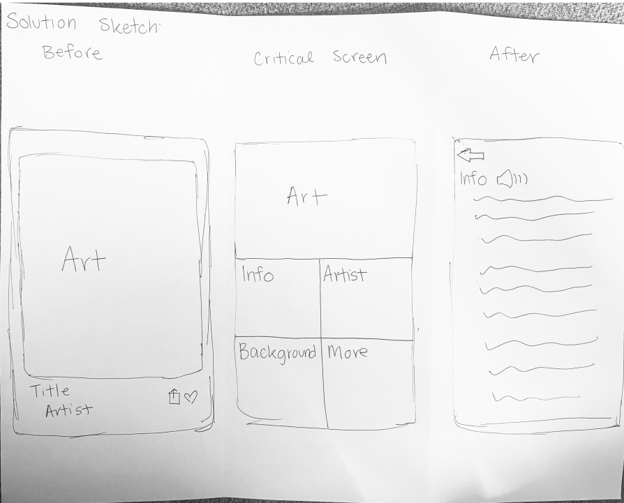
My Solution Sketch shows the most important screens for the users. For me, that is the page with the art that gives users options for what they wish to learn about the piece they have selected.
The most important part to me was to show the menu on the bottom to make it easier for users to go back to whichever page they’re looking for.
The interviews were done in person. Each person was very friendly and open minded. I informed them about GalleryPal and what is required from them on this experience. I introduced the prototype and explained the task required of them.
All testers had no issues with the prototype at all. There were no questions asked while they performed the test. The most common statements were on the UI of the app. They found that the app was lacking visually. This was a comment noted by all testers.
”Why hasn’t this been created before? I think a lot of people would find it useful”
The main finding from the testing was that the UI was the biggest issue among testers. They found that although the UX of the app was simple and achieved the goal, it lacked anything style wise.
Reflections
